
Notice
Recent Posts
Recent Comments
Link
| 일 | 월 | 화 | 수 | 목 | 금 | 토 |
|---|---|---|---|---|---|---|
| 1 | 2 | 3 | 4 | 5 | 6 | 7 |
| 8 | 9 | 10 | 11 | 12 | 13 | 14 |
| 15 | 16 | 17 | 18 | 19 | 20 | 21 |
| 22 | 23 | 24 | 25 | 26 | 27 | 28 |
Tags
- useEffect return
- 머쓱이
- 인프런 자바스크립트 알고리즘 문제풀이
- KDT 프로그래머스 데브코스 프론트엔드
- 모던 자바스크립트 Deep Dive TIL
- 개발자 특강
- 모던 자바스크립트 딥다이브
- Frontend Roadmap
- Vue3
- 모던 자바스크립트 Deep Dive
- useRef 지역 변수
- frontend roadmap study
- 프로그래머스 데브코스 프론트엔드
- 백준 node.js
- K_Digital Training
- 프로그래머스 데브코스
- 리팩토링 회고
- TypeScript 문법 소개
- react customHook 예시
- KDT 프로그래머스
- 투포인터알고리즘 js
- 모던 자바스크립트 TIL
- 프로그래머스 데브코스 프론트엔드 TIL
- Vue3 Router
- 우테캠 회고록
- 백준 js
- 프로그래머스 K_Digital Training
- 프로그래머스 K_Digital Training 프론트엔드
- react 프로젝트 리팩토링
- 모던 javascript Deep Dive
Archives
- Today
- Total
프론트엔드 개발자의 기록 공간
[React] React(3) 본문
❗❗ 데브코스 52일차 (10.12)
React를 잘 다루기 위해서는 컴포넌트를 잘 만들 줄 알아야 한다.
중요도를 따지면 컴포넌트가 8할 나머지가 2 할이다.
다른 기능들도 컴포넌트를 잘 쓰기 위함이라고 생각한다.
이번 React를 진행하는 강사님께서 말씀해 주신 문장이다. React는 컴포넌트 기반이기 때문에 위의 글에 공감한다.
때문에 기반이 되는 컴포넌트에 익숙해지기 위해 계속 컴포넌트를 만드는 연습으로 강의가 진행된다.
우선 React + emotion +StoryBook 조합으로 진행된다.
✅ Text 컴포넌트
const Text = ({
  children,
  size,
  strong,
  underline,
  delete: del,
  color,
  block,
  paragraph,
  ...props
}) => {
  const Tag = block ? 'div' : paragraph ? 'p' : 'span'
  const fontStyle = {
    fontWeight: strong ? 'bold' : undefined,
    fontSize: size,
    color,
    textDecoration: underline ? 'underline' : undefined,
  }

  if (del) {
    children = <del>{children}</del>
  }

  return (
    <Tag style={{ ...props.style, ...fontStyle }} {...props}>
      {children}
    </Tag>
  )
}

export default Text- block 타입에 따라 div, p, span 태그로 구분 지어준다.
- props로 받은 스타일을 적용시켜준다.
- if (del) 구문을 통해 취소 선을 설정해 준다.
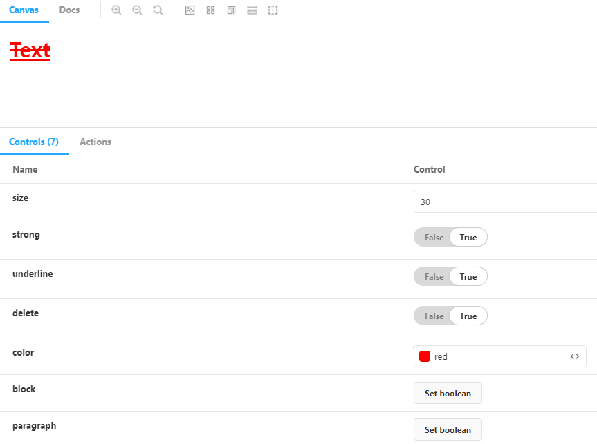
📚 Text 컴포넌트 사용법 - StoryBook
import Text from '../components/Text'

export default {
  title: 'Component/Text',
  component: Text,
  argTypes: {
    size: { control: 'number' },
    strong: { control: 'boolean' },
    underline: { control: 'boolean' },
    delete: { control: 'boolean' },
    color: { control: 'color' },
    block: { control: 'boolean' },
    paragraph: { control: 'boolean' },
  },
}

export const Default = (args) => {
  return (
    <>
      <Text {...args}>Text</Text>
      <Text {...args}>Text</Text>
    </>
  )
}
✅ Button 컴포넌트
import styled from '@emotion/styled'

const Button = styled.button`
  display: block;
  height: 40px;
  width: 100%;
  padding: 8px 6px;
  color: white;
  border: none;
  outline: none;
  border-radius: 4px;
  background-color: black;
  box-sizing: border-box;
  cursor: pointer;

  &:hover {
    background-color: #333;
  }

  &:active {
    background-color: #555;
  }

  &:disabled {
    background-color: #999;
  }
`

export default Button
📚 Button 컴포넌트 사용법 - StoryBook
import Button from '../components/Button'

export default {
  title: 'Component/Button',
  component: Button,
  argTypes: {
    onClick: { action: 'onClick' },
  },
}

export const Default = (args) => {
  return <Button {...args}>Button</Button>
}
위의 두 컴포넌트는 간단한 예시를 소개한 것이다. Text, Button 등등의 여러 컴포넌트들이 모여 하나의 기능, 도메인, 페이지 등이 될 수 있다.
✅ 로그인 폼
import styled from '@emotion/styled'
import useForm from '../hooks/useForm'
import Button from './Button'
import Input from './Input'
import ErrorText from './ErrorText'
import CardForm from './CardForm'
import Title from './Title'

const SignUpFrom = ({ onSubmit }) => {
  return (
    <>
      <CardForm onSubmit={handleSubmit}>
        <Title>Sign Up</Title>
        <Input
          type="text"
          name="name"
          placeholder="Name"
          onChange={handleChange}
        />
        {errors.name && <ErrorText>{errors.name}</ErrorText>}

        <Input
          type="password"
          name="password"
          placeholder="Password"
          onChange={handleChange}
          style={{ marginTop: 8 }}
        />
        {errors.password && <ErrorText>{errors.password}</ErrorText>}

        <Input
          type="password"
          name="password-confirm"
          placeholder="Password confirm"
          onChange={handleChange}
          style={{ marginTop: 8 }}
        />
        {errors.passwordConfirm && (
          <ErrorText>{errors.passwordConfirm}</ErrorText>
        )}

        <Button type="submit" style={{ marginTop: 16 }} disabled={isLoading}>
          Sign Up
        </Button>
      </CardForm>
    </>
  )
}

export default SignUpFrom- 모든 코드를 포함하지 않았기 때문에 감안하고 보면 된다.
이처럼 여러 컴포넌트들을 불러와서 로그인 폼이라는 하나의 기능 혹은 페이지가 완성됐다.
다른 컴포넌트에서도 props의 옵션 값만 필요에 따라 지정해 주고 사용하면 독립적으로 사용하되 컴포넌트 재활용성은 가져갈 수 있다. 그래서 제일 작은 단위의 컴포넌트를 설계하는 것이 가장 중요하다.
👨💻 강의를 수강할 당시에는 그냥 그러려니 하면서 들었던 것 같다. 왜냐하면 컴포넌트의 설계의 중요성이나, 재사용을 직접 할 일이 없었기 때문이다. 하지만 나중에 프로젝트를 수행하면서 공통된 기능을 찾고, 그 기능을 컴포넌트화 시키는 과정을 직접 겪으면서 이러한 과정이 중요하다는 것을 깨달았다.
📖 학습한 내용
- React(3) - 컴포넌트 연습하기
- Text
- Header
- Image
- Spacer
- Spinner
- Toggle
728x90
'프로그래머스 데브코스_FE > TIL' 카테고리의 다른 글
| [React] React(5) (0) | 2022.01.24 |
|---|---|
| [React] React(4) (0) | 2022.01.23 |
| [React] React(2) (0) | 2022.01.18 |
| [React] React(1) (0) | 2022.01.17 |
| [Vue3] 영화 검색 사이트 프로젝트 (0) | 2022.01.14 |
'프로그래머스 데브코스_FE/TIL' Related Articles
more

Comments